Vivid Seats operates in the competitive space of event tickets, where these companies need both the chicken and the egg to have any chance at success. What I mean by that is they require both the ticket buyers and ticket sellers. Sellers won’t put their tickets up for sale if they don’t think there’s enough buyers on the platform and buyers need a good selection and fair prices to keep coming back.
But both require a good user experience that makes the process of buying and selling as smooth, enjoyable and intuitive as possible. That’s why Vivid Seats, today, launched a redesign of its mobile app.
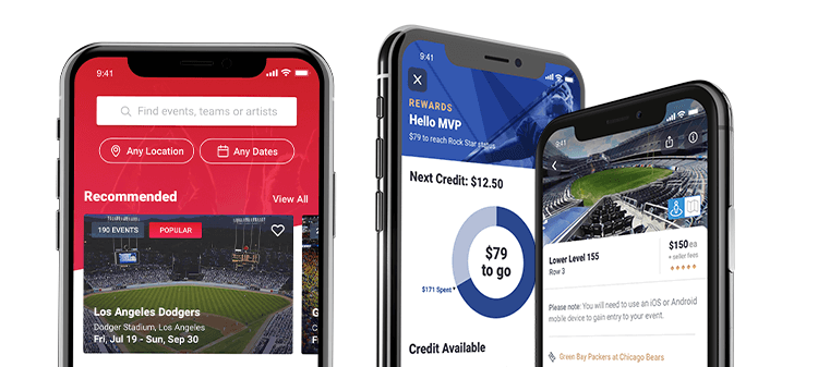
The company says the redesign provides users a new way to discover, search and shop for the best live events across sports, music, theater and more, utilizing popular, trending and recommended events. The browsing experience has also been revamped, moved to the forefront of the app so that users can find their desired event as easily as possible. It’s a mobile first approach that leverages user’s interests, location and other attributes to deliver a personalized shopping experience. Oh, and it also includes a new, best-in-class loyalty program: Vivid Seats Rewards.
I got the chance to speak with Melody McManus, Vice President, Product and User Experience at Vivid Seats to dive deeper into the redesign. Here’s an edited transcript of our conversation:

Adam: When is the last time you did a redesign?
Melody: Our mobile app first launched in 2015. Since then, we’ve made a number of small tweaks and improvements, but this is a complete overhaul that brings numerous benefits to the forefront for our users.
Adam: How did you and your team come to the conclusion that you wanted to redesign the app?
Melody: The redesigned app is based around exploration and discovery. Previously, we had excelled at directing customers to the events they had been looking to attend. With the redesign, we want to offer a whole new experience including more functionality and the ability to discover live events and artists similar to those they already like. We’ve got Ariana Grande tickets, but we want you to check out Lizzo too.
Adam: How’s it trending? Have you done user trials to test out your hypothesis?
Melody: In the end, customers always know best. We have done extensive testing with focus groups, large market user tests and of course, an internal beta. We’re passionate about our customers — and live events — so we’ve taken all the feedback very seriously and have used these insights to further shape the look, feel and functionality of the app. That being said, we made sure not to change the things about Vivid Seats that people know and love.
Adam: The new user experience sounds very personalized. How does this work for a new user? Will their experience be less personalized than recurring users?
Melody: Personalization is definitely a key component and our goal is to turn new users into returning ones. We’ve crafted the experience to be positive regardless of how familiar the customer is with our platform. New users will certainly not have an inferior experience.
Adam: Talk to me about the physical changes. Is there be an app icon/logo change? What about colors and fonts? If so, why?
Melody: We’re not changing the app icon, we actually gave it a bit of a refresh about four months ago. We have a strong brand, and we want to hold on to what makes us so special. Our main colors (black, red and white) are not changing. We want to be on-brand while simultaneously making the experience more engaging. What we’re doing is providing a richer experience by using tertiary color and placing variation where it’s needed. We’ve brought in some gold, some greys and a blue tone. The category pages have more interesting colors in order to highlight certain areas. I think we struck the right balance between adding new colors and sticking to the core elements of our brand.
Adam: That’s the look, what about the feel?
Melody: If it throws anyone off, we have not succeeded. Great design should not involve instruction. The feel remains the same. It looks like us and feels like us, just better.

Adam: The redesign seems focused on the buyers. Will sellers see any additional value, or are they impacted simply because you anticipate buyer conversion to be higher?
Melody: We’re a marketplace, and any changes made to our platform are intended to be a positive for all users.
Adam: This redesign includes a new loyalty program. Tell me about that.
Melody: We’ve always supported our customers through our 100% Buyer Guarantee. Now, users can earn credit back on purchases simply by using the new Vivid Seats app. The Vivid Seats Rewards loyalty program includes all app users, no sign up required, and all purchases count towards credit back. For more information, visit www.vividseats.com/rewards.
Adam: Anything else to add?
Melody: Stay tuned for additional changes to the new Vivid Seats app that allow for even more customization. We’re excited to show you what we’ve been working on!
Melody McManus is the VP of Product and User Experience for Vivid Seats, North America’s leading independent ticket marketplace. Her 20-year career spans industries from banking and media to consumer goods and online marketplaces, with past roles ranging from Development and Quality Assurance to Product and Mergers & Acquisitions. Her accomplishments include repeated success at optimizing technology, business, and product e-commerce functions and systems to directly impact the bottom-line. McManus earned a Bachelors of Engineering in both Electrical Engineering and Computer Science from Vanderbilt University.


