We’ve all been confronted with a mobile app that was not built with the user experience in mind. Thankfully, design and development best practices for mobile have become more generally accepted, bringing with them more consistent user experiences.
So, what are some of these UX best practices for designing mobile apps?
Some of the concepts we cover can be overlooked during QA testing, but become starkly evident when users get their hands on it, literally. These concepts include but are not limited to:
- Loading screens
- Size of touchable elements
- Reachable thumb zones
Loading Screens
Often the first and most frustrating part of any software experience is latency. Loading screens are probably the worst first impression you can make but they are basically unavoidable. However, it is possible to handle loading screens with grace.
Loading screens can be a great opportunity to introduce users to the brand or immediately offer value while users wait. Slack, for example, uses skeleton screens and displays insightful quotes, funny one-liners, and even offers basic onboarding tips.

When considering how to handle your loading screens, think about how you can keep users engaged long enough for the app to load. Perhaps you have secret features or tips that can help advance the user’s experience.
Sometimes, users just need to be entertained long enough to not close or worse, uninstall the app before loading is complete. In this case, try including a subtle animation or entertaining visual for users to stay engaged.
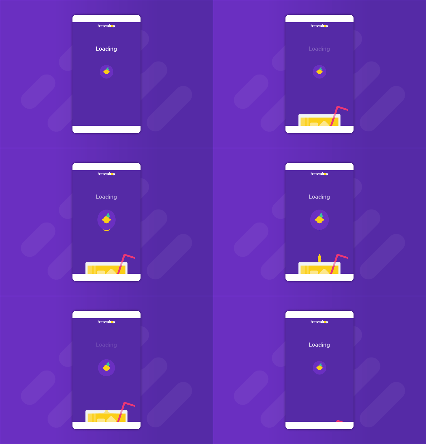
Try testing different strategies to determine what works best for your users.
Size of touchable elements
Have you ever wondered why we use QWERTY keyboards? Is it because it’s the most efficient layout? No.
The QWERTY keyboard was created to solve a problem common with early typewriters. When typing, the arms of sequential letters that stamp ink to the blank page would constantly get entangled. The QWERTY keyboard organized the keys in a way that solved this problem.
Although it’s likely too late to retrain typists on different albeit more efficient keyboards, it’s not too late to retrain app developers to size elements appropriately.

Kidding aside, there are few things more frustrating when using an app (maybe loading screens) than a button or element that is impossible to get your finger on. This is especially annoying when trying to perform a certain function actually enables a separate, undesired function. If, for example, you are trying to press the 15-second rewind button on Spotify and instead you hit the full rewind taking you back to the beginning of the track, it can be infuriating.
Reachable Thumb Zones
Probably one of the most overlooked user experience features in mobile ux design are reachable thumb zones. When you consider the varying screen and hand sizes, app-specific functionality, and standard hand orientation for mobile device usage you can start to see why reachable thumb zones are important.
Most people handle their phone with one or two hands, using their thumbs to navigate the app’s user interface. It can be very difficult to reach for the top left corner of the screen when handling the phone with a single right hand.
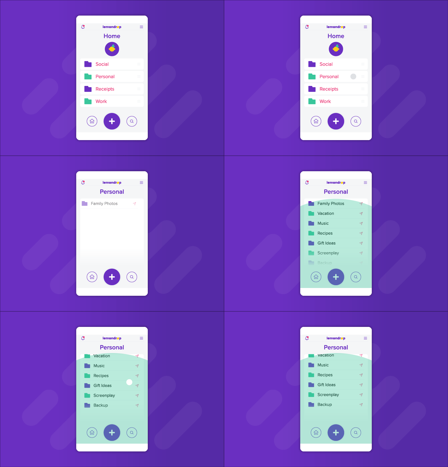
Consider keeping popular buttons and features within the reachable thumb zones. For concerns about limited UI space, less frequented but necessary functions can be placed outside of the reachable thumb zones.
For more mobile app design tips for an epic user experience, check out the full infographic from CleverTap.

